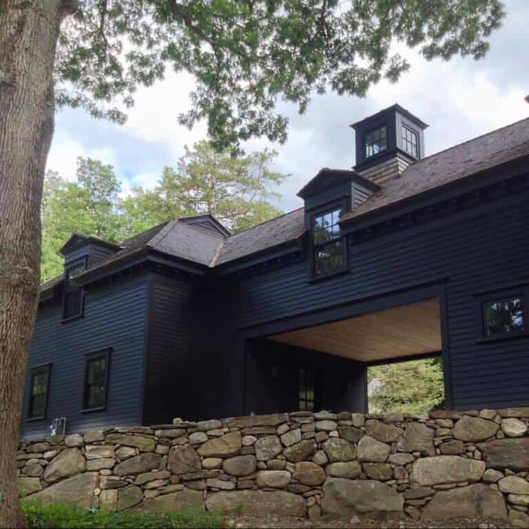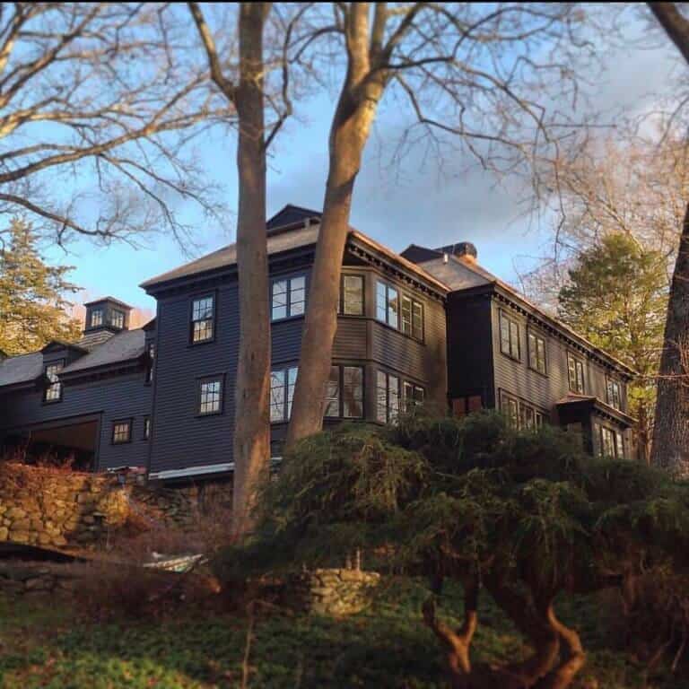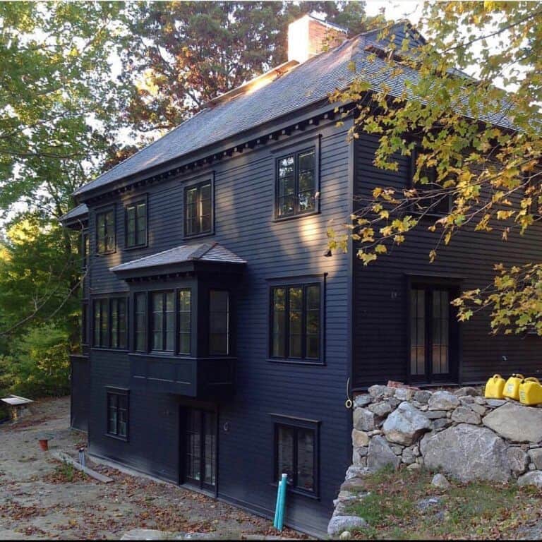



ready to Change up the exterior of your house and go Dark?
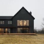
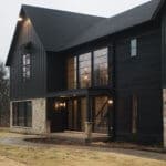
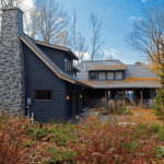
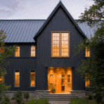
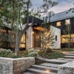
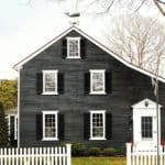
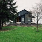
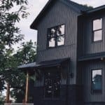
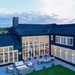
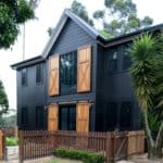
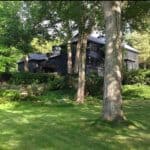
Here are 28 dark exterior ideas to revolutionize your house.

It’s no secret I love a dark exterior on a house, well really any building for that matter!
I wanted to compile some of my favorite dark exterior ideas to help revolutionize your house if you’re toying with the idea of going to the dark side!
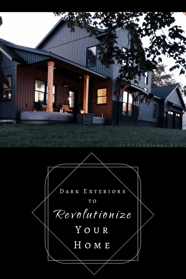
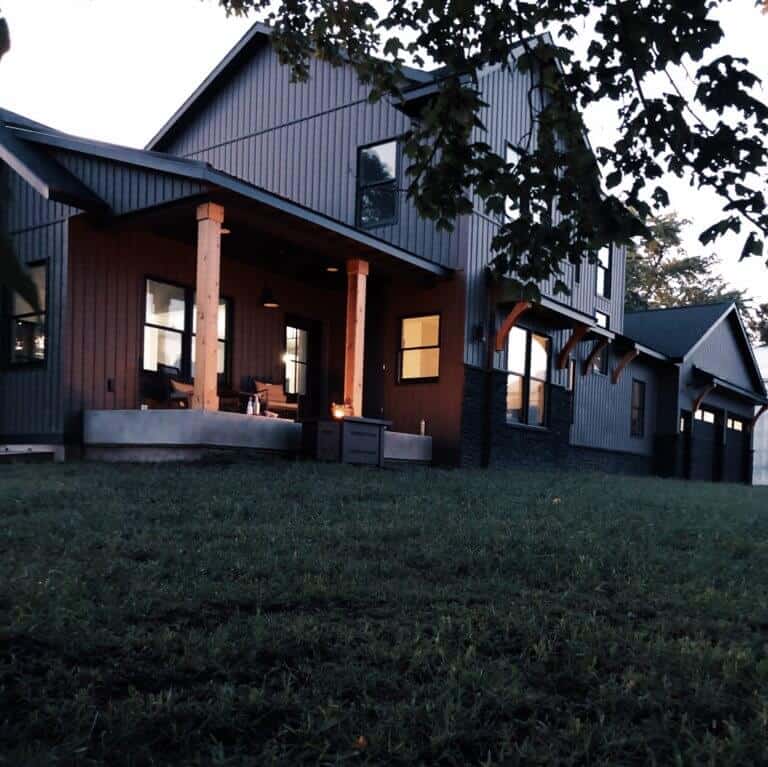
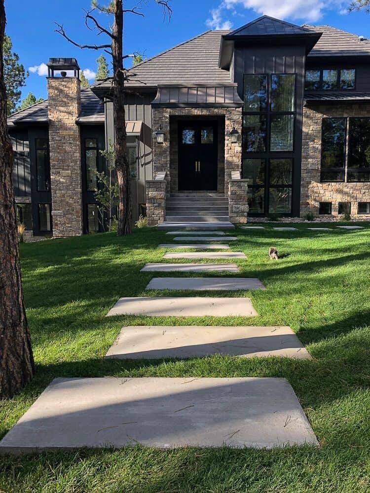
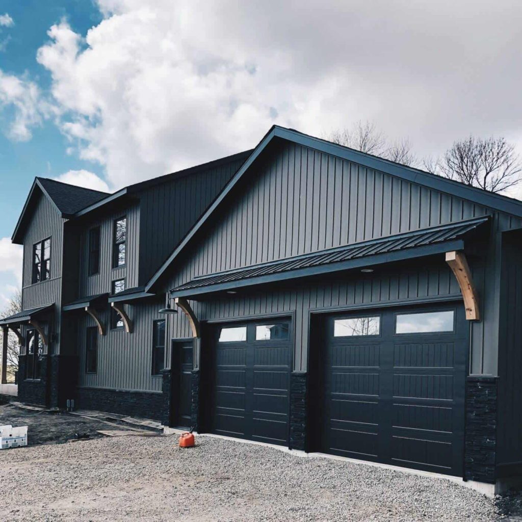
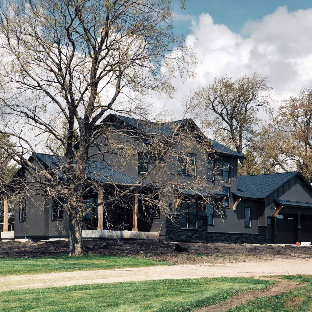
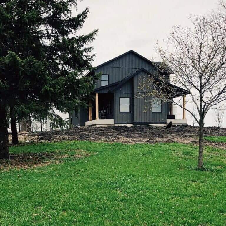
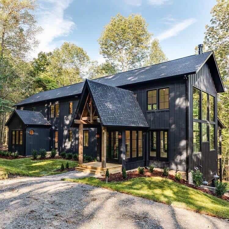
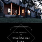
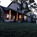
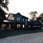
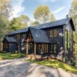
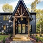
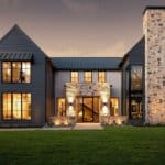
Below is a photo of our dark modern farmhouse that we just built. We’re thrilled with how it turned out and very happy that we went dark and monotone.
To contrast or not to contrast? That is the question!
One of the biggest questions I hear when going dark is, “do we use contrasting stone, roof, windows against the dark siding or go monotone?”
It’s really a personal preference, and I feel it depends on the surrounding elements of the home. I’ve seen both, and I love both.
I’ve tried to include some of each type for you here so you can get an idea of whether you like contrast or not.
Where my love affair with dark exteriors began
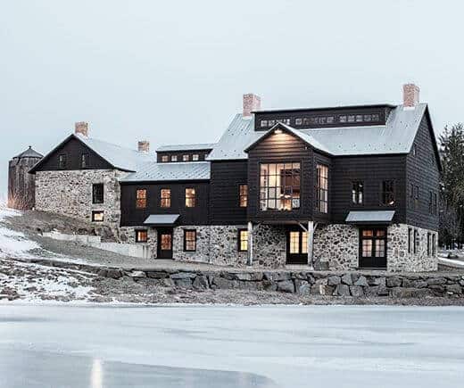
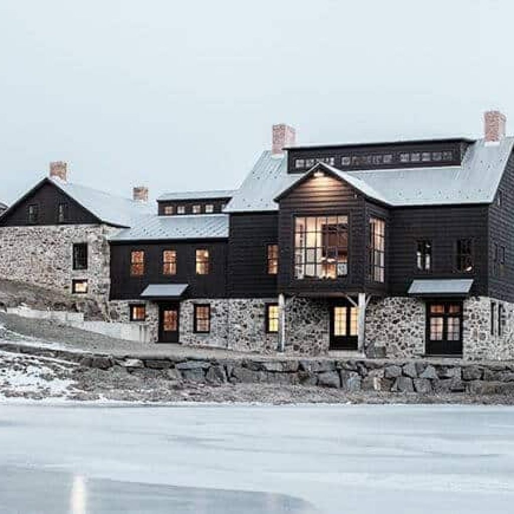
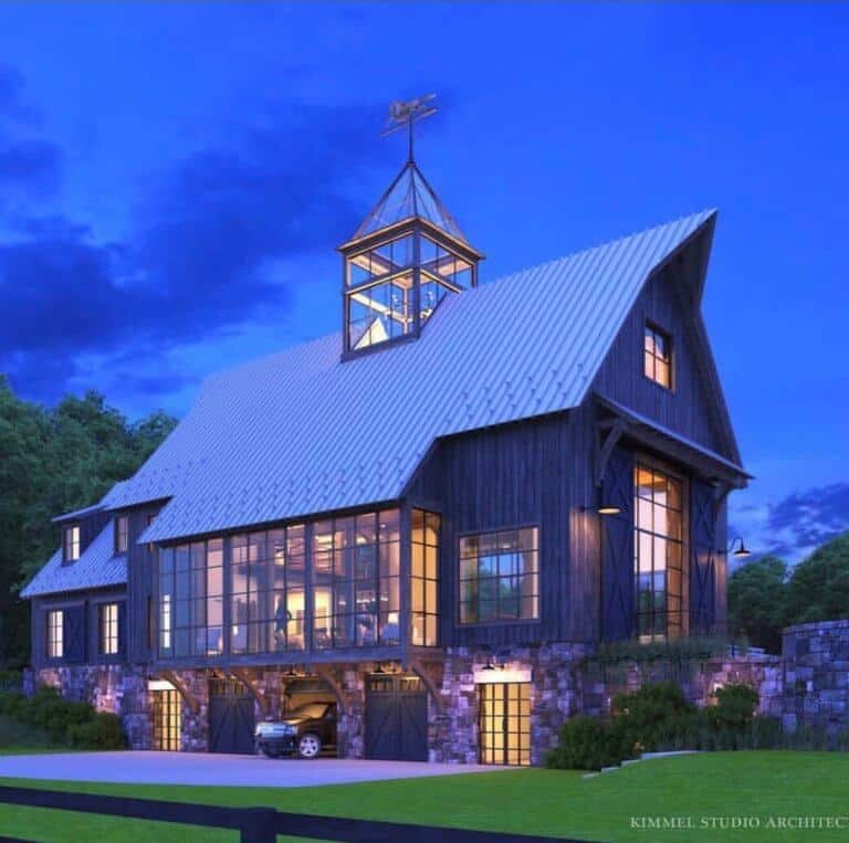
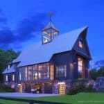
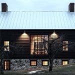
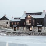
I pretty sure this is the first dark exterior photo I saw and thus began my love affair with dark homes.
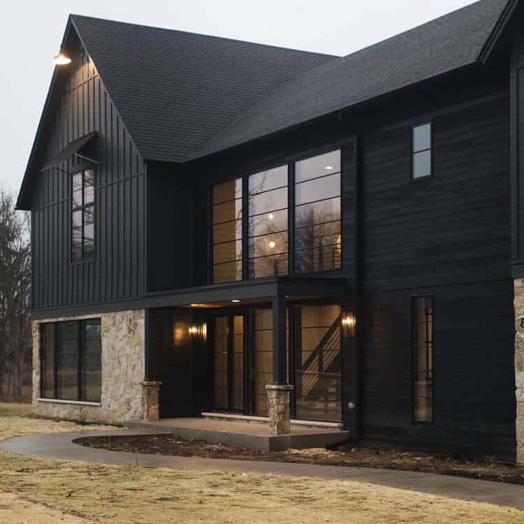
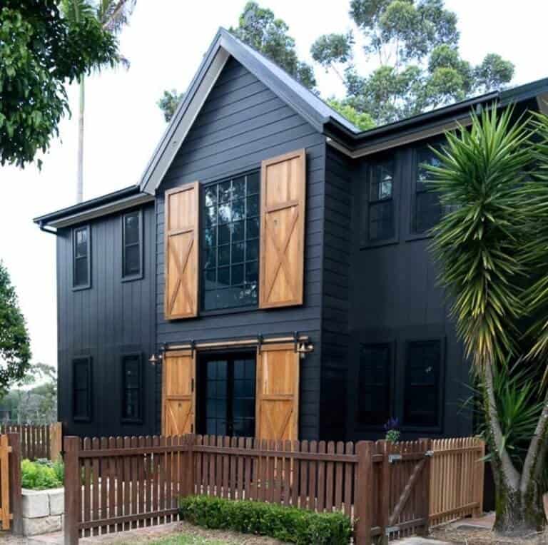
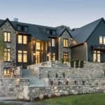
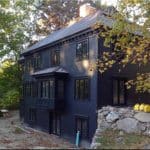
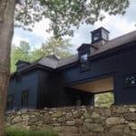
This renovated Dutch Stone & Black Barndominium is absolutely stunning. This exterior uses contrasting stone and lighter steel roofing to offset the black siding.
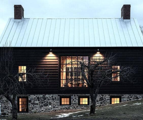
dark exteriors with contrasting elements
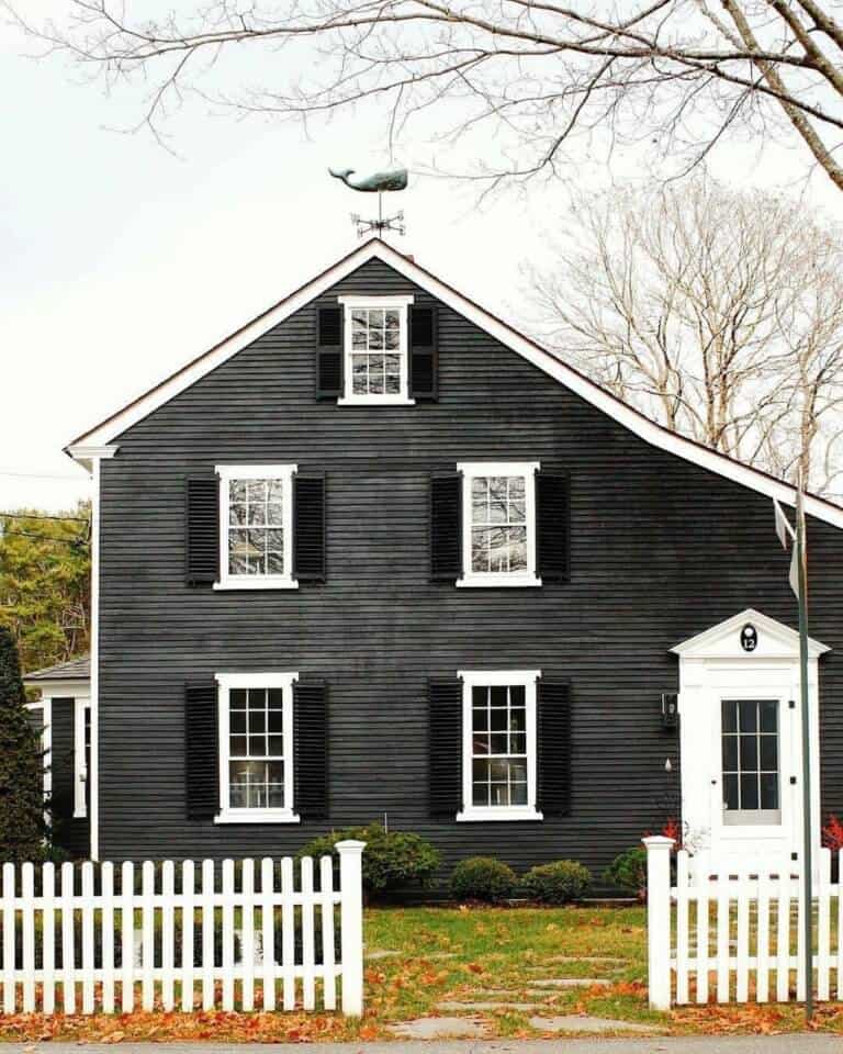
Dark exteriors with minimal contrasting elements
Here are some more dark exterior ideas to change the look of your house!
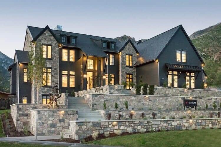
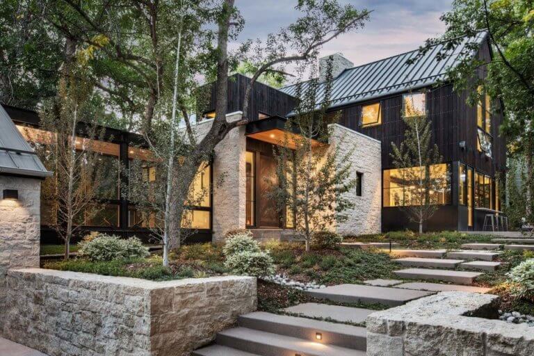
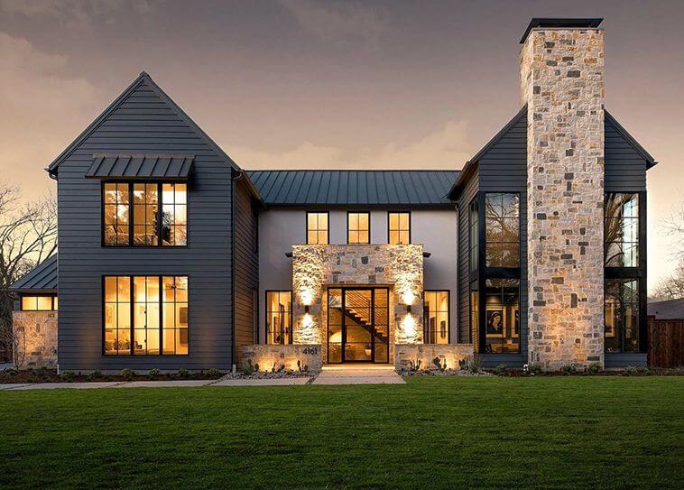
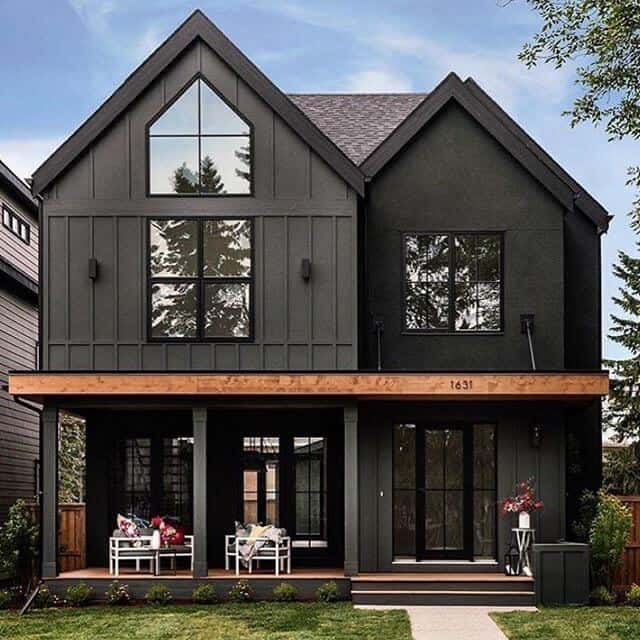
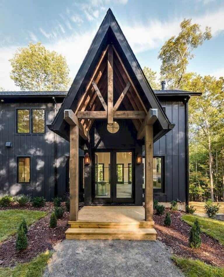
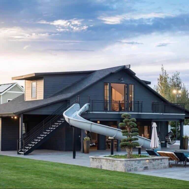
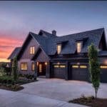
These home are mostly dark, but feature slight contrasts in usually one element.
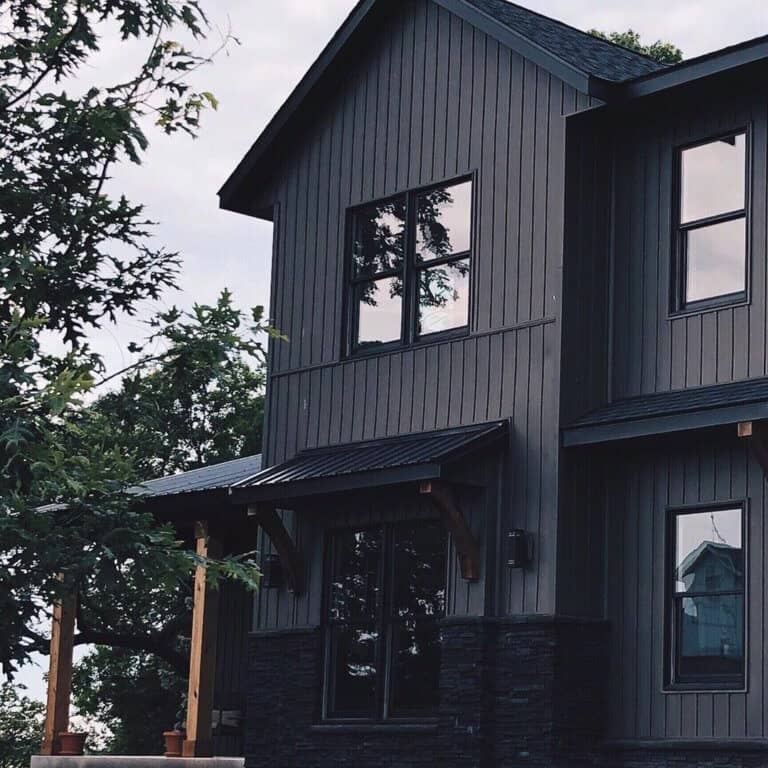
For instance, in our house, we chose to go all dark with siding, windows, stone and a mix of shingles and steel roofing.
Where we added the pop of contrast was in the cedar pillars and corbels under the steel eyebrows.
This adds just a hint of contrast, but keeps the monotone theme going.
Some of these houses chose their pop of contrast in just the stone or the window color. Look through these options and let me know which is your favorite!
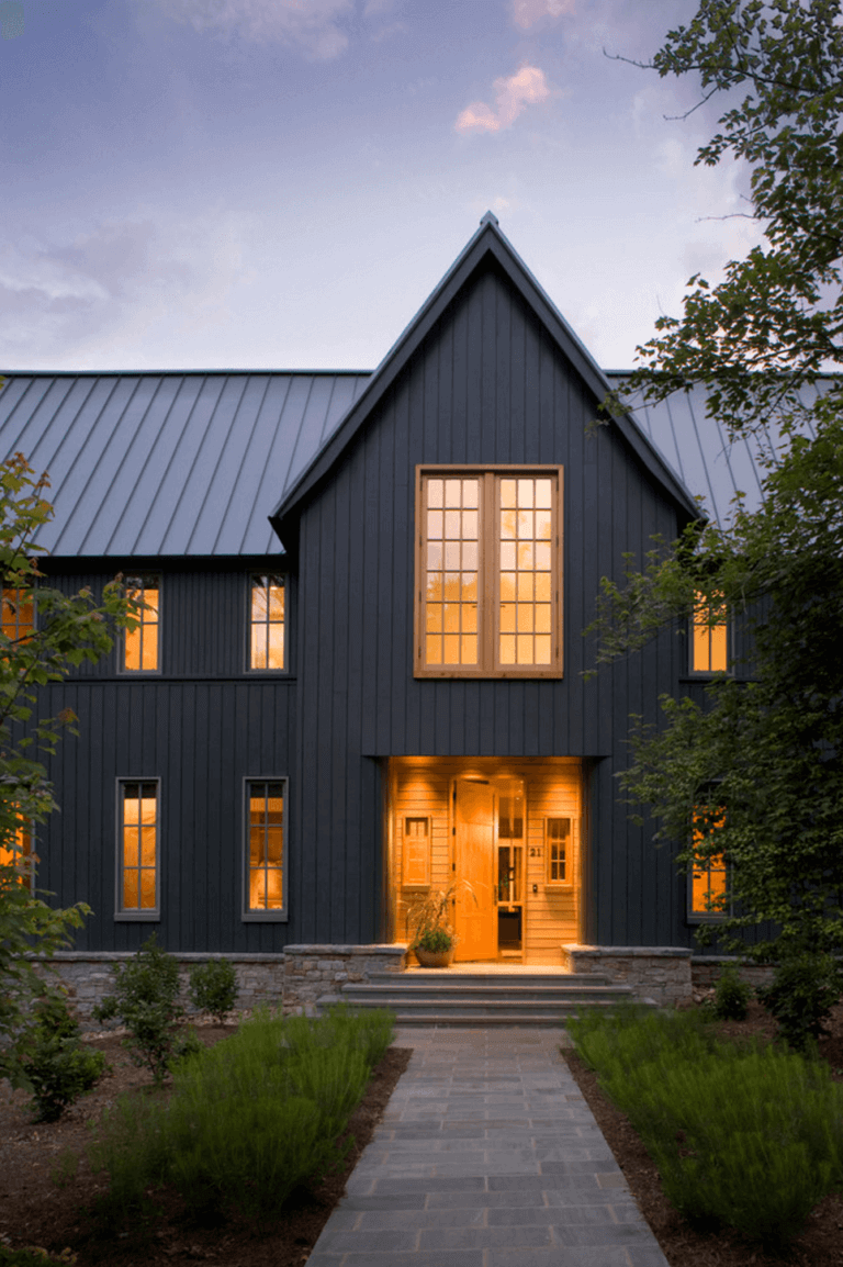
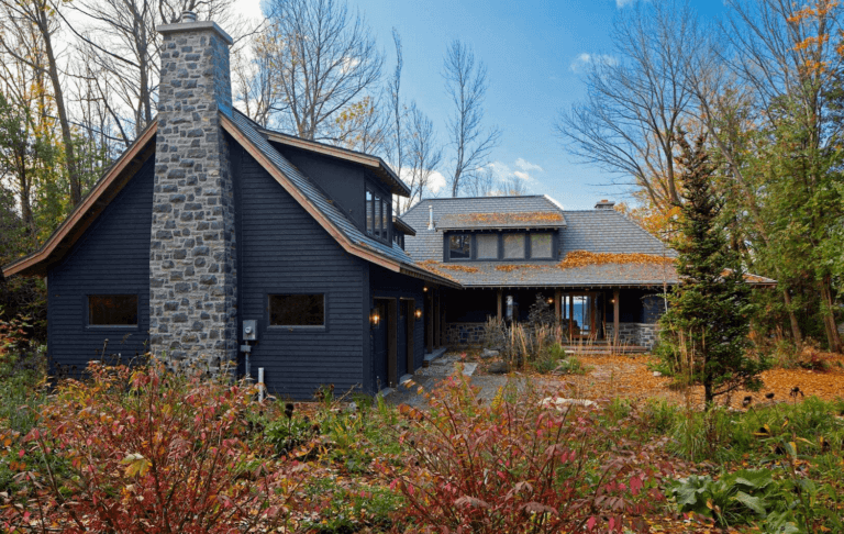
Monotone Dark
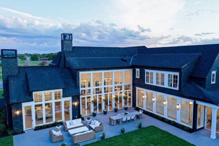
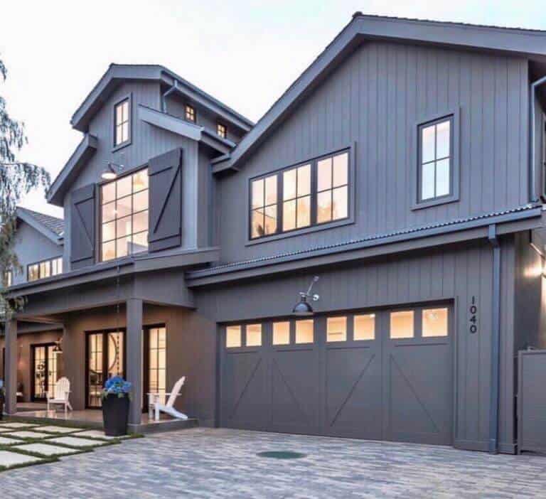
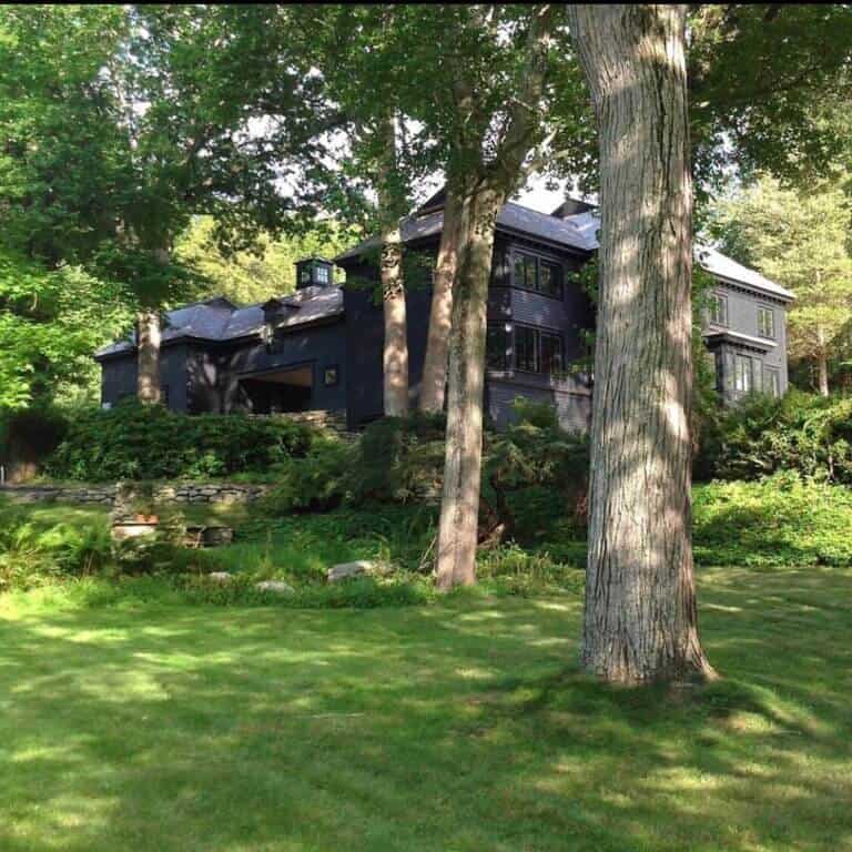
These homes feature a total monotone dark exterior look, which would definitely revolutionize your house!
Instead of using any color contrast, they’ve chosen texture contrast and directional elements to add visual interest.
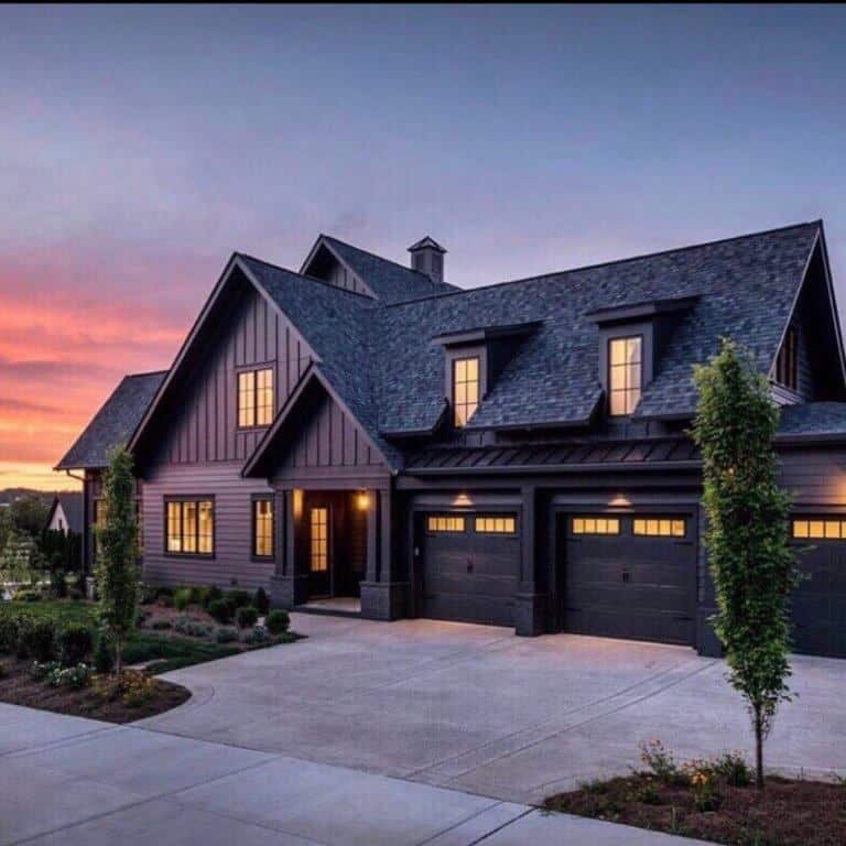
What’s that mean Leah?! Well, take a look at this first house by Legend Homes.
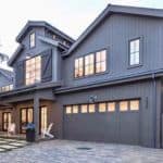
They used vertical board and batten in the gable (triangular piece in the peak), horizontal siding on the main level, shingles on the main portion of the house and steel roofing over the eyebrows on the garage.
This mix of directional materials and textures adds the visual interest that is usually taken care of by color.
What do you think?!
did you pick a favorite dark exterior?
will you be changing your home exterior and going dark?!
You'll be the boldest house on the block if you do!!
